OUR BLOG
What are Muted Colors?
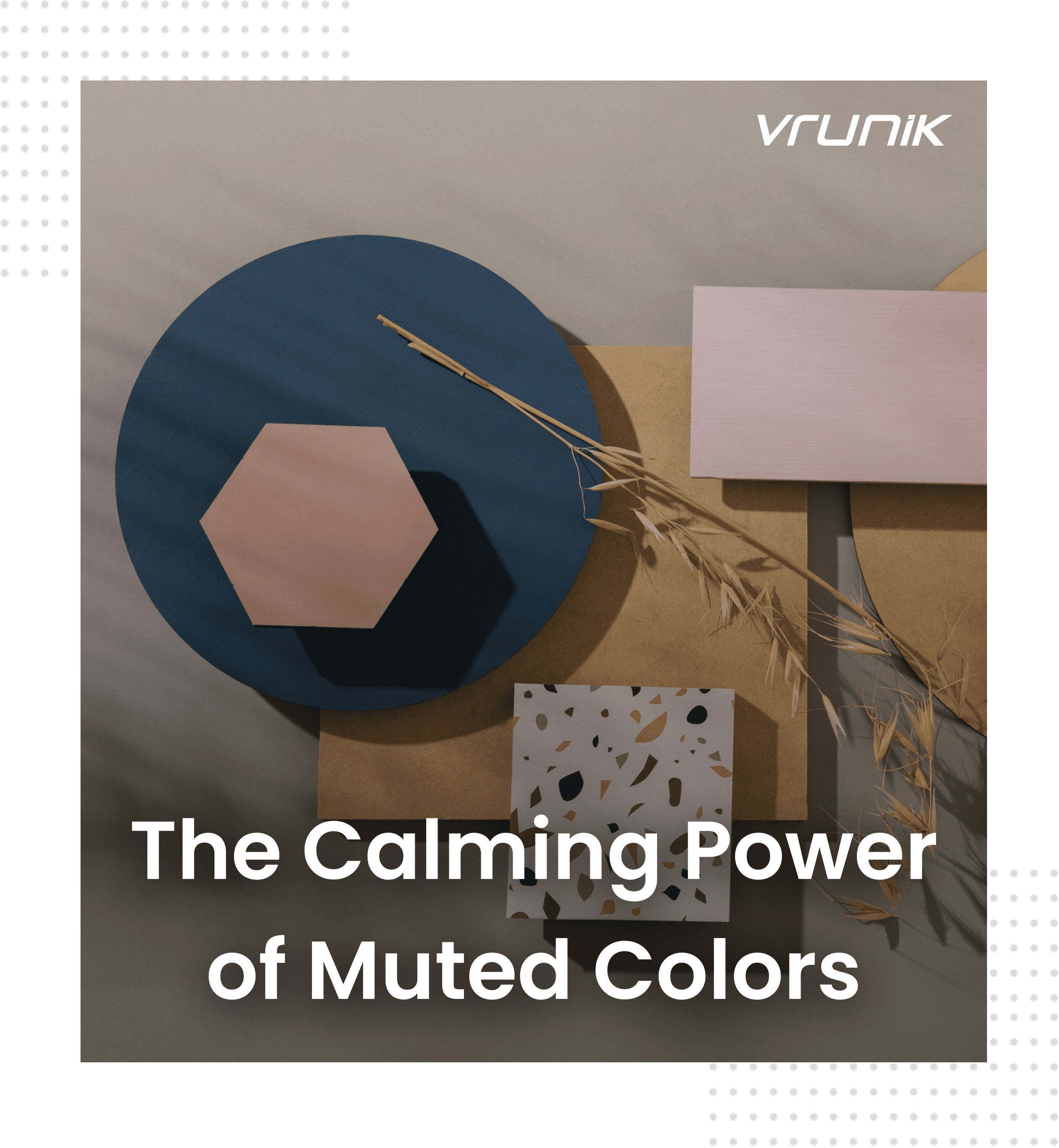
A Guide to Tranquil and Sophisticated UX Design
Diving into the realm of design, we’re often captivated by the vibrant hues that ignite our senses and steer our emotions. But what about the understated charm of muted colors? These subtle shades often fly under the radar but pack a punch when it comes to design. Let’s take a deep dive into the world of muted colors – their significance, psychology, and how they can transform UX design into a tranquil and sophisticated experience.
Unveiling the allure of subtlety, muted colors, also known as desaturated or subdued tones, possess a unique quality of toning down vibrancy. Picture a fiery red cooled off with a hint of gray – that’s the essence of a muted color. These hues exude sophistication, tranquility, and timeless elegance, offering a calming and inviting ambiance perfect for prioritizing focus, relaxation, and trust in user experiences.
But there’s more to muted colors than meets the eye. Beyond aesthetics, studies unveil their remarkable ability to evoke feelings of calmness and relaxation. This makes them a go-to choice for crafting serene atmospheres in apps, websites, or any digital product where users seek concentration or unwinding. Just imagine navigating a travel website amidst a riot of bright colors versus a serene interface adorned with muted blues and greens – the latter instantly setting a peaceful tone for exploration.
The magic of muted colors lies in their versatility. They seamlessly blend to create a spectrum of moods, from airy to dramatic, offering a timeless appeal that keeps designs relevant for extended periods.
Now, let’s delve into the science behind muted colors. Unlike vibrant or pastel palettes, muted colors strike a balance in saturation, providing a more refined take on color without overwhelming the senses.
When it comes to combining muted colors, the possibilities are endless. Sage green paired with dusty rose conjures a sense of calmness and nature, perfect for spa websites. Taupe mingled with blush creates a soft and elegant ambiance, ideal for luxury e-commerce platforms. Navy alongside light gray exudes a timeless and professional vibe, fitting for corporate websites or financial applications.
The benefits of integrating muted colors in UX design are manifold. They promote calmness and focus, elevate aesthetic appeal, offer greater versatility, and enhance readability and accessibility for all users.
Numerous successful brands harness the power of muted tones to create user-friendly interfaces that instill trust and ease. Take Airbnb, for example, with its calming palette of beige, taupe, and light blue, fostering a seamless browsing experience amidst a sea of tranquility.
Beyond Airbnb, brands like Evernote, Slack, and Pinterest employ muted color palettes to craft visually pleasing and emotionally resonant user experiences.
Now, let’s delve into mastering muted colors for effective UX design:
- Choosing the Right Muted Shades: Consider the desired mood and target audience.
- Temperature: Cool tones evoke calmness, while warm tones offer comfort.
- Value: Experiment with lightness and darkness to evoke spaciousness or intimacy.
Strategically adding pops of vibrant color to muted palettes can enhance visual interest without overpowering users. Typography and contrast play crucial roles in ensuring readability and harmony, while advanced techniques like gradients and textures can elevate designs further.
Accessibility remains paramount in UX design, and while muted colors offer numerous advantages, it’s essential to ensure sufficient contrast for users with visual impairments.
As we navigate further it is essential to master the art of incorporating muted colors effectively. Here are some additional insights to help you refine your approach:
- Balancing with Accents: While muted palettes exude tranquility, strategic accents of vibrant color scan inject energy and visual appeal into designs. Consider using these accentssparingly on elements like call-to-action buttons or notifications to create focal points without overwhelming users. Additionally, exploring muted accent colors themselves can add depth and intrigue to your design palette, enhancing its overall sophistication.
- Typography and Contrast: Achieving optimal readability and harmony in designs with muted
backgrounds requires careful consideration of typography and contrast. Ensure that text
stands out clearly against background colors by selecting appropriate font weights and sizes.
Tools such as WebAIM’s contrast checker can assist in maintaining sufficient color contrast,
thus improving accessibility for all users. - Advanced Techniques: Elevate your use of muted colors by experimenting with advanced
techniques such as muted color gradients and textures. Muted color gradients add subtle
depth and visual interest to designs, while textures can enhance engagement by providing
tactile elements. By mastering these techniques, you can create truly immersive and
captivating user experiences that resonate with your audience. - Accessibility Considerations: Inclusive design practices are integral to effective UX design.
While muted colors offer a soothing aesthetic, it’s crucial to ensure accessibility for all users,
including those with visual impairments. Adhering to WCAG guidelines and utilizing
accessibility tools can help ensure that your designs are usable and enjoyable for everyone.
Let’s further delve into the evolving trends and potential applications of muted colors in UX design.
- Future Trends: As technology progresses, we anticipate seeing muted colors utilized in
innovative ways that enhance user experiences. Consider the prospect of muted color
animations, where subtle shifts in color create dynamic yet calming interactions. Picture
a loading animation transitioning through muted greens and blues, providing users with
a sense of serenity while indicating progress. Such animations can offer a seamless and
engaging experience, blending functionality with aesthetics. - Personalization: The future of UX design lies in personalization, and muted colors can
play a significant role in this realm. Imagine interfaces that adapt their color palettes
based on user preferences, providing a tailored experience that resonates on an
individual level. For instance, a meditation app could allow users to select a muted color
scheme that reflects their mood or preferences, fostering a deeper sense of connection
and engagement. - AR/VR Experiences: Muted colors hold immense potential in augmented reality (AR)
and virtual reality (VR) experiences, where creating immersive environments is
paramount. Imagine exploring a virtual museum with muted walls and exhibits, allowing
users to focus on the artwork without visual overload. By leveraging muted colors in
AR/VR applications, designers can create captivating and comfortable experiences that
transport users to new realms while maintaining a sense of tranquility and immersion. - Cross-Platform Consistency: Muted colors offer a versatile solution for maintaining
consistency across various digital platforms. Whether designing for web, mobile, or
desktop applications, muted color palettes can seamlessly adapt to different screen sizes
and resolutions while preserving the overall aesthetic coherence. This consistency
enhances user familiarity and usability, fostering a sense of continuity across multiple
touchpoints. - Emotional Engagement: Beyond aesthetics, muted colors have a profound ability to
evoke emotions and establish connections with users. By carefully selecting and
harmonizing muted tones, designers can create interfaces that resonate with users on
an emotional level, fostering trust, comfort, and a sense of belonging. Whether
designing for productivity apps, social networking platforms, or e-commerce websites,
the emotional resonance of muted colors can significantly impact user engagement and
loyalty. - Brand Identity: Muted colors can play a pivotal role in defining and reinforcing brand
identity. When used thoughtfully and consistently, muted color palettes become
synonymous with a brand’s values, personality, and aesthetic sensibility. By
incorporating muted colors into brand assets such as logos, typography, and marketing
materials, companies can establish a distinctive visual identity that resonates with their
target audience and sets them apart from competitors. - Cultural Considerations: In a globalized world, designers must consider cultural
preferences and sensitivities when selecting color palettes for international audiences.
Muted colors often possess a universal appeal that transcends cultural boundaries,
making them an ideal choice for creating inclusive and accessible user experiences. By
embracing muted color palettes that resonate with diverse cultural backgrounds,
designers can ensure that their designs are relevant and engaging to audiences around
the world. - Sustainability and Wellness: As society increasingly prioritizes sustainability and wellness, muted colors emerge as a natural choice for promoting environmentally conscious and mindful design practices. Muted color palettes evoke a sense of harmony with nature and promote feelings of calmness and balance, aligning with the principles of eco-friendly and wellness-oriented design. By integrating muted colors into sustainable products, services, and digital experiences, designers can contribute to a more holistic and mindful way of living.
Let’s further explore the ways in which muted colors can enrich UX design and enhance user experiences:
- Psychological Impact: Muted colors have a subtle yet profound psychological impact on users. By evoking feelings of calmness, tranquility, and sophistication, these colors create a conducive environment for focused interaction and meaningful engagement. Whether designing for productivity tools, educational platforms, or entertainment applications, the psychological effects of muted colors can shape user behavior and perception, leading to more positive and fulfilling experiences.
- Visual Hierarchy: Muted colors can be utilized strategically to establish visual hierarchy
within user interfaces. By assigning different levels of saturation or brightness to elements
such as buttons, menus, and content blocks, designers can guide users’ attention and
streamline navigation. Muted colors help prevent visual clutter and maintain clarity,
ensuring that users can easily prioritize and interact with essential features and information. - Timelessness and Longevity: Unlike trendy or faddish color schemes, muted colors possess a
timeless quality that transcends fleeting design trends. Incorporating muted tones into UX
design ensures longevity and relevance, allowing interfaces to remain visually appealing and
effective over time. Whether designing for short-term campaigns or long-term projects,
muted colors offer a versatile and enduring solution that withstands the test of time. - User Empowerment: Muted colors empower users by creating a serene and harmonious
digital environment where they can focus, explore, and express themselves freely. By
minimizing visual distractions and reducing cognitive load, muted color palettes enable users
to engage with content and functionality more intuitively and confidently. This sense of
empowerment fosters a positive user experience and cultivates a lasting connection
between users and digital products or services. - Cross-Cultural Communication: Muted colors transcend linguistic barriers and facilitate
cross-cultural communication in digital design. Universally appealing and culturally
adaptable, muted color palettes resonate with diverse audiences around the globe,
promoting inclusivity and accessibility. Whether designing for local markets or international
audiences, designers can leverage muted colors to create interfaces that resonate with users
from different cultural backgrounds, fostering empathy, understanding, and connection.
In summary, the benefits of muted colors in UX design are manifold, encompassing psychological impact, visual hierarchy, timelessness, user empowerment, and cross-cultural communication. By embracing the versatility and inherent qualities of muted colors, designers can create user experiences that are not only aesthetically pleasing but also functional, engaging, and meaningful.
Let’s continue to explore the vast potential of muted colors in UX design and leverage their transformative power to shape a brighter and more inclusive digital future.
- What defines a color as “muted” in the realm of design?
Muted colors are those that have been desaturated or toned down in terms of vibrancy. They often have a softer, more subdued appearance compared to their more vibrant counterparts. - How do muted colors differ from vibrant or bold colors in terms of visual impact?
Muted colors have a more subtle and understated visual impact compared to vibrant or bold colors. While vibrant colors can be attention-grabbing and energetic, muted colors tend to create a more relaxed and sophisticated atmosphere. - What are the key characteristics and attributes of muted color palettes?
Muted color palettes are characterized by their subdued tones and reduced saturation. They often evoke a sense of calmness, sophistication, and timelessness. Muted colors can range from soft pastels to deeper, earthy tones. - How can muted colors contribute to creating a sense of calmness and sophistication in design?
Muted colors have a calming effect on viewers due to their softer and less intense appearance. They create a more serene and tranquil atmosphere, which can help users feel more relaxed and focused. Additionally, muted colors are often associated with sophistication and elegance, making them a popular choice for high-end and luxury brands. - What are some common examples of muted colors, and how are they commonly used in design?
Common examples of muted colors include soft pastels like blush pink, sage green, and dusty blue, as well as earthy tones like taupe, olive green, and slate gray. These colors are often used in interior design, fashion, branding, and digital design to create a subtle and refined aesthetic. - How do designers select and combine muted colors to achieve desired aesthetic effects?
Designers often consider factors such as the mood or atmosphere they want to create, the target audience, and the overall branding or design concept when selecting and combining muted colors. They may use color theory principles like complementary or analogous color schemes to create harmonious and visually appealing combinations. - What psychological effects do muted colors have on users, and how can they influence user experience?
Muted colors have been shown to promote feelings of calmness, relaxation, and trust. In design, they can help create a more welcoming and comfortable user experience, especially in environments where users need to concentrate or unwind, such as websites, apps, or digital products. - In what contexts or industries are muted colors particularly popular or effective?
Muted colors are commonly used in industries and contexts where a calm, sophisticated, or timeless aesthetic is desired. This includes interior design, fashion, branding, digital design, and marketing for products or services targeting a more discerning or refined audience. - What are some practical tips for incorporating muted colors into design projects?
When incorporating muted colors into design projects, it’s essential to consider factors such as contrast, readability, and accessibility. Designers should also experiment with different combinations and shades of muted colors to find the most effective and visually appealing options for their specific project or brand. - How do muted colors contribute to creating a timeless and enduring visual appeal in design?
Muted colors have a timeless quality that transcends passing trends or fads. Their understated elegance and versatility make them well-suited for creating designs that remain relevant and visually appealing over time. By incorporating muted colors into design, creators can achieve a classic and enduring aesthetic that stands the test of time.
If you are interested in learning more about how UX design can help to transform your legacy systems and ensure business continuity, please feel free to reach out to me at nk@vrunik.com or call +91 9554939637.