Blog
UX for Manufacturing: Streamlining Industrial Control Systems
UX Design
8 min read

Introduction
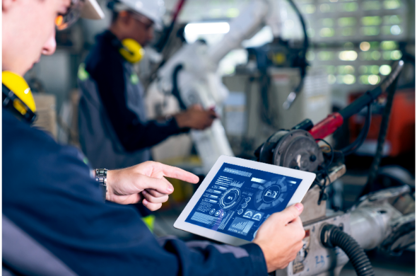
When most people think of User Experience (UX) design, they probably imagine sleek apps or consumer websites. But UX is just as critical in industrial control systems, which are the backbone of many manufacturing processes. As automation continues to shape industries, the relationship between operators and these complex systems becomes increasingly important. A thoughtfully designed user interface can simplify complex tasks, boost productivity, enhance safety, and even improve the bottom line. Let’s dive into how UX design can make industrial control systems easier to use and more effective.
Step 1: Understand the Unique Context of Manufacturing Workflows
Before jumping into designing, it’s essential to really grasp the environment where these systems are used. Industrial control systems operate in fast-paced, high-pressure settings, and they’re often incredibly intricate. Here are a few things to keep in mind:
- User Diversity
- Manufacturing facilities are filled with people of all different backgrounds and skill levels. Some operators have been doing this for decades, while others might be new to the field. A good UX design needs to cater to both. Seasoned operators need quick access to crucial info, while newbies may need more guidance and intuitive controls.
Example: Take a look at the UAE’s oil refineries, where workers from all over the world come together. The systems need to work for local workers, expatriates, and even short-term contractors. A multilingual interface is a must—Arabic, English, and Hindi are just a few of the languages you might encounter. Senior operators who know the ins and outs of the machinery need an interface that gives them everything they need at a glance. But a new hire? They’ll need clearer directions, tooltips, and step-by-step guides to help them understand what’s going on.
- Safety and Compliance
- Safety isn’t just a priority; it’s a matter of life or death in manufacturing settings. A poor decision or delayed action can lead to accidents, equipment failure, or worse. The design of the interface must prioritize emergency controls, hazard alerts, and safety-critical information.
Example: Consider the UAE’s strict safety protocols, especially in sectors like construction and oil. Workers in a plant or refinery might need to act fast if something goes wrong. An intuitive emergency button or flashing alert could make all the difference in preventing an accident. For instance, in a refinery in Abu Dhabi, a large, easily visible red button could signal a gas leak, prompting operators to take immediate action.
- Environmental Constraints
- Manufacturing environments are rarely ideal for tech. Operators often work in noisy, poorly lit spaces, or have to wear safety gear like gloves and helmets. UX design needs to consider these factors and create systems that are still easy to use in less-than-ideal conditions.
Example: In the UAE’s construction industry, workers often wear thick gloves to handle heavy machinery or materials. In these settings, a UX interface that’s designed for touch-screen functionality, even with gloves on, is incredibly important. Imagine trying to tap small icons or buttons while wearing bulky gear—that’s where thoughtful design really shines.
Step 2: Dive Deep into User Research
Knowing your users inside and out is essential to creating a great UX. Understanding how operators engage with the system can reveal insights that drive better design decisions. Here’s how to approach it:
- Field Observations
- Sometimes, the best way to understand how someone uses a system is to watch them in action. Pay attention to the challenges they face and where things slow down. You’ll spot pain points that might not be obvious from just looking at the data.
Example: At Dubai International Airport, air traffic controllers are under extreme pressure to manage flights efficiently. By watching them navigate the control system during peak hours, UX designers can identify pain points like overly complex navigation or too many manual inputs. By addressing these issues, the system could run more smoothly, helping controllers avoid delays and focus on what matters most.
- Task Flow Mapping
- Mapping out how tasks are carried out can shed light on unnecessary steps or bottlenecks that could be eliminated. It’s all about simplifying workflows without sacrificing accuracy.
Example: In a UAE manufacturing plant, operators might have to juggle between multiple screens to check on machine diagnostics. If they could get everything on a single dashboard, it would save them time and reduce errors. Task flow mapping would show where improvements can be made, streamlining the entire process.
- Interviews and Surveys
- Talking to operators can uncover frustrations that aren’t visible through observation alone. Whether through interviews or surveys, getting feedback directly from users gives you a clearer picture of what’s working and what’s not.
Example: In a Dubai-based smart factory, operators may report that they often miss critical alerts because they’re buried among too many other notifications. Based on this feedback, designers could adjust the system to better prioritize and highlight urgent messages, ensuring operators stay focused on the most pressing issues.
Step 3: Develop User Personas
User personas are incredibly helpful in UX design, especially when you’re trying to cater to a wide variety of users. They represent the different types of people who will interact with your system, and they help guide design decisions. In the context of manufacturing control systems, you might have a few key personas:
- Experienced Operators
- These are the veterans of the factory floor. They know the ins and outs of the system and need an interface that gives them quick access to detailed information. Efficiency is key.
Example: In a UAE petrochemical plant, experienced operators need quick access to real-time data—temperature, pressure, and machine status. The last thing they need is a complicated interface that slows them down. Instead, an efficient dashboard that presents key metrics at a glance can help them make quick decisions, especially during emergencies.
- New Operators
- These users may be less familiar with the systems and need a bit more help navigating. A simplified interface, complete with clear instructions and tutorials, can make a world of difference.
Example: In the UAE’s aluminum factories, new operators might struggle with the complexity of machinery controls. A UX interface that walks them through each step—complete with visuals and tooltips—can prevent confusion and help them learn quickly, ensuring they operate the machines correctly.
- Maintenance Technicians
- These users are responsible for keeping everything running smoothly. They need systems that give them access to diagnostics, error logs, and real-time machine health data.
Example: In Dubai’s smart factories, maintenance technicians rely on systems that alert them to machine issues before they become full-blown problems. Predictive maintenance data—like alerts for worn-out parts—ensures technicians can fix things before they fail, saving time and money.
Step 4: Prioritize Data Presentation and Visual Hierarchy
The way data is presented can make or break a system. Operators need to process complex information quickly and accurately, and a good UX design should make this as easy as possible.
- Real-Time Data Feeds
- Manufacturing environments are dynamic, and operators need access to real-time data to make informed decisions. Whether it’s machine status, temperature, or pressure, this data needs to be updated continuously.
Example: In UAE’s solar power plants, operators monitor the efficiency of solar panels in real-time. An interface that updates key data like energy production or panel temperature every few seconds allows operators to address potential issues before they turn into major problems.
- Clear Visual Hierarchy
- The information you present should be easy to digest. The most important data—like emergency alerts—should be front and center, while less critical info can be displayed in a less prominent way.
Example: In Dubai’s robotics factories, operators need to focus on critical issues like equipment malfunctions or downtime. A visual hierarchy that uses color-coded alerts—red for urgent issues, yellow for warnings, and green for normal—ensures that operators can take quick action when needed.
- Visual Cues
- Visual cues like color coding or flashing indicators are powerful tools in helping operators make sense of complex information at a glance.
Example: In a UAE chemical plant, a flashing red indicator might signal a hazardous leak, while green indicates that everything is functioning normally. These cues help operators make fast decisions in high-pressure situations.
Step 5: Simplify Navigation and Control Access
Control systems often involve navigating through several screens and menus to get to the information you need. The goal of UX design should be to streamline this process and minimize unnecessary complexity.
- Dashboard Design
- A good dashboard shows the most important information in a clear, concise way. It should also allow operators to access more detailed data without feeling overwhelmed.
Example: In Dubai’s desalination plants, a dashboard could give operators a quick snapshot of water production, energy usage, and equipment status. With a few clicks, they can dive deeper into any area that needs attention.
- Shortcut Controls
- For operators who need to move quickly, customizable shortcuts can save time and improve efficiency.
Example: In the UAE logistics sector, warehouse managers can benefit from shortcut controls that give them instant access to real-time inventory levels or shipping statuses, reducing the time spent searching through menus.
- Multi-Tier Navigation
- Break down the information into layers, so operators can access critical data quickly and dive into more detailed settings only when necessary.
Example: In UAE manufacturing plants, a multi-tier navigation system could allow operators to access essential metrics like machine status or production speed on the first level, with more detailed settings—like maintenance logs or production reports—available at deeper levels.
Conclusion
Designing UX for manufacturing control systems in the UAE isn’t just about creating interfaces that look nice—it’s about making operators’ lives easier, safer, and more efficient. By understanding their needs and environment, prioritizing simplicity, and continuously refining the system based on real feedback, manufacturers can build systems that are not only functional but also drive productivity and innovation. And as automation continues to evolve, it’s essential that UX design keeps pace to ensure that people are always at the heart of these complex systems.